2017 – 2022 © All rights reserved – R11 Solutions
Share the Knowledge
In this final article in our series on crafting content that converts, we will discuss the visual presentation of your content and the readability of your content. Even with the best content, if it isn’t visually appealing and easy to read, your visitors won’t stay on the page very long.
In Part 1 of the series, we discussed how to attract the right people with your content and how to motivate them to take action through your content. In Part 2 of the series, we provided you with a framework for engaging the reader and leading them through a sales journey that can culminate in conversion. This final article provides the final touch to those lessons.
Have you ever picked up a book or an instruction sheet and said, “I can’t read that! The text is too small?” There are several visual aspects of your online content that can make the reader uncomfortable. Not only will that discomfort distract from the message, but it may also prevent the online visitor from reading it at all.
Chooses font styles for your website content can be as tricky as selecting images or color palettes. The variety is truly endless. New fonts are created daily. As you begin your consideration of font choices for your web content, keep your target audience in mind.
The look and style of your font can communicate different attributes. A delicate script font may give a sense of the feminine or elegance, but it can sometimes be challenging to read. Bold, boxy fonts may communicate a commanding or authoritative voice.
So how do you choose?
Experienced web designers understand the strengths and weaknesses of fonts in communicating with an online audience. They can advise you on font selections that will be best suited for your audience. They will also be able to help you to select complementary fonts to use to create a distinction between headings and the body of the text.
Trust their professional opinions in this area of content design, as well as choosing the sizing of the fonts for different pieces of text.
When we talk about white space, we are talking more about “space” than about the color of the space. The term white space is used to refer to the blank areas surrounding a block of text. The more white space surrounding each block or paragraph of text the better.
The paragraphs of text in your content should be short, 2-5 sentences. A blank space should appear between your paragraphs, as seen in this article. You will also notice that online text seldom uses an indent to identify the beginning of a paragraph. The blank line is the indicator of a new paragraph. Bulleted or numbered lists are also a great way to create white space that gives more prominence to text that may be important to the reader.
When you become focused on the written content, you can easily overlook the importance of images and color choices as they relate to the text. Your site visitors will experience different feelings based on the background color and the font colors you use. There is no right or wrong here. It all depends on what emotional impression you want your brand to convey.
You may notice that financial and insurance websites often use blue in their branding. Studies have determined that blue can encourage a sense of trust, making it a good choice for those industries.
There also needs to be a proper amount of contrast between your background colors and your font colors. A light-colored font on a light background color can require a greater effort to read. Again, let your web professional give you guidance in this area. Trust their instincts.
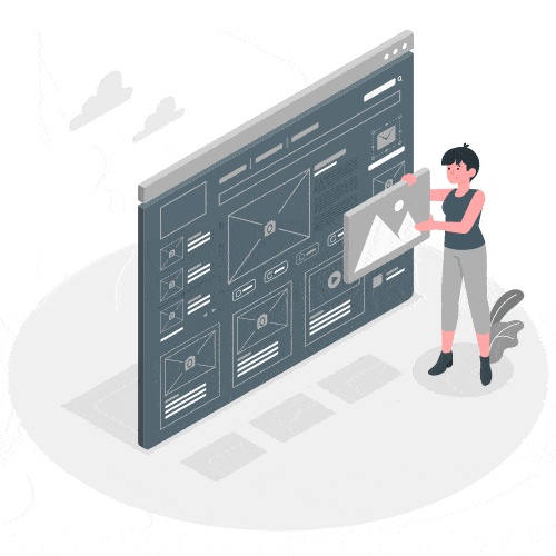
Images attract attention and communicate associations with the reader. The images and icons you use with your text should always be complimentary. Consider the outcome you are presenting in the text when choosing images.
If your text talks about creating clean, fresh air, use an image that illustrates that sense of fresh air. And, don’t hesitate to use images throughout your page to draw the reader downwards to each new section of text. The proper combination of images and text multiply the power of each.
Did you know that Google rates your content and gives it a readability score based on the vocabulary you use? The current preferred standard for most web content is an 8th-grade reading level. There are exceptions, of course, but for most content, this is true. Vocabulary isn’t the only measure of readability. Google also looks at your individual sentences to determine how difficult they are to read. One of the primary measures for this aspect of your content is the length of your sentences.
When we speak verbally, we often use long, compound sentences. In verbal conversations, the speaker can pause or change the tone to keep the listener following their train of thought. That isn’t the case with written text, especially text read online.
By the time the reader reaches the end of a sentence that is two or more lines long, they may have forgotten the subject that started the sentence. Whenever possible, keep your sentences short and concise. You may need to break your sentence into multiple sentences if you have an abundance of commas or conjunctions in it.
If you’ve read through the entire 3-article series on creating quality content to improve your conversion rate, you should have learned one thing – quality content is much more than just information about your business.
Your online content is the equivalent of a salesman, your main contact point with potential customers. You don’t hire just anyone to serve in that capacity. The selection of the person who crafts your online content deserves the same due diligence on your part. They should be experienced and able to validate their capabilities with past projects and client recommendations.
We created this series of articles to help businesses to understand, not just the value of quality content, but the detailed process that goes into creating that copy. Professional content can and should deliver a significant return on investment (ROI). At R11 Solutions, we work with experienced copywriters to maximize the conversion rates of our clients.
This article is Part 3 of a series that gives guidance on how to create content that converts. Conversion-focused content will engage your readers, and ultimately, increase your ROI. We encourage you to contact us to learn more about how R11 Solutions can elevate you and your business.
2017 – 2022 © All rights reserved – R11 Solutions
Share the Knowledge